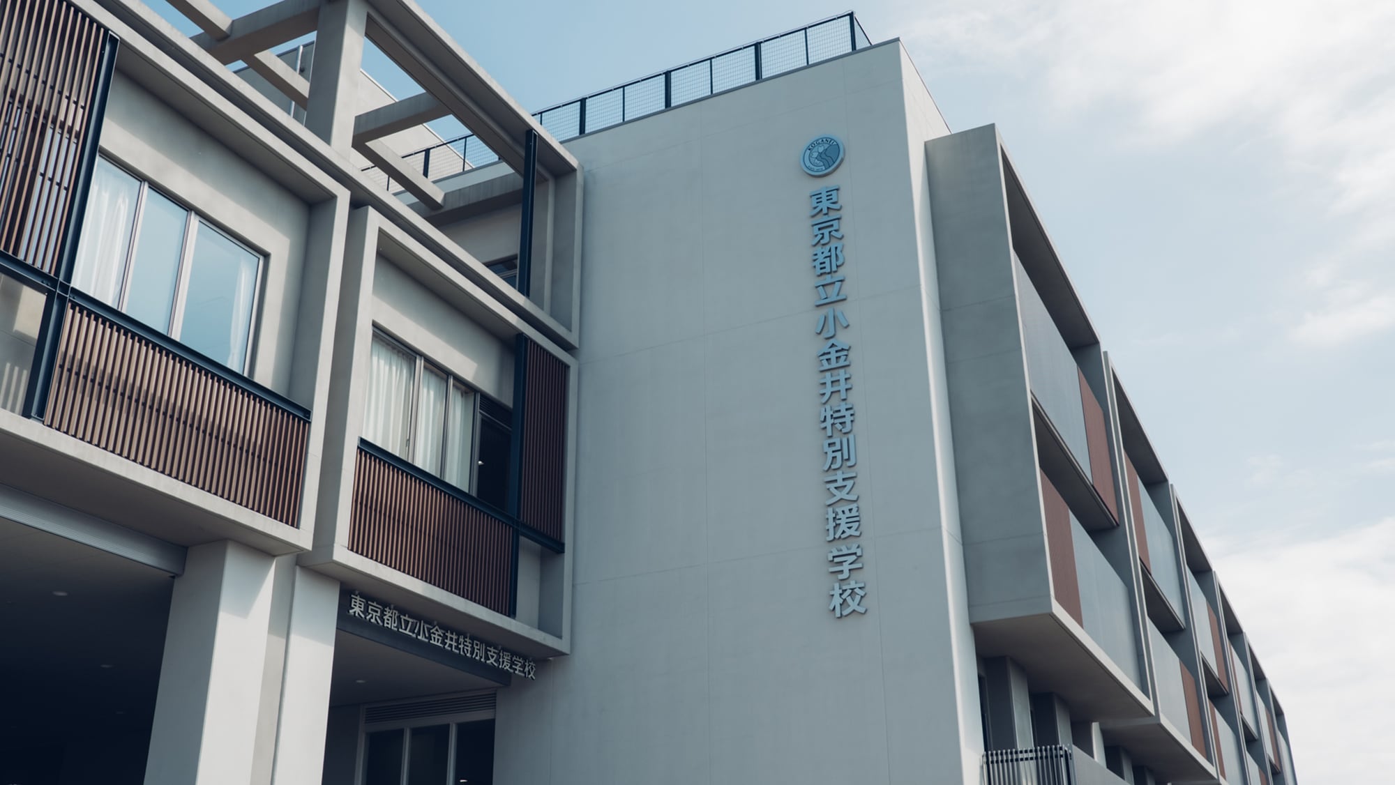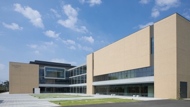
This is the Koganei Special Education School in Tokyo, the new building of which finished being built in April 2018.
A wealth of ideas encouraging the pursuit of a fun and engaging academic life can be found throughout the school.
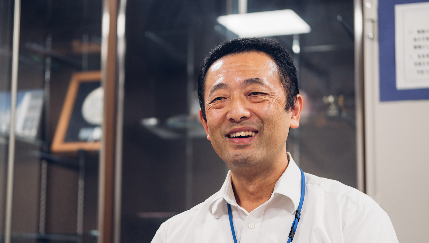
School principal Takeshi Kaneko is proud of the result, saying, “Every aspect of the schoolhouse is designed with the children in mind.”
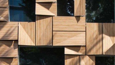
Using shapes and colors to make the space more intuitive for youngsters.
There are special education schools catering to different needs. At ours, we focus on mental disabilities. These children excel at obtaining information more through sight than sound. To that end, we found ways to incorporate forms and colors to make the school environment more agreeable to them.
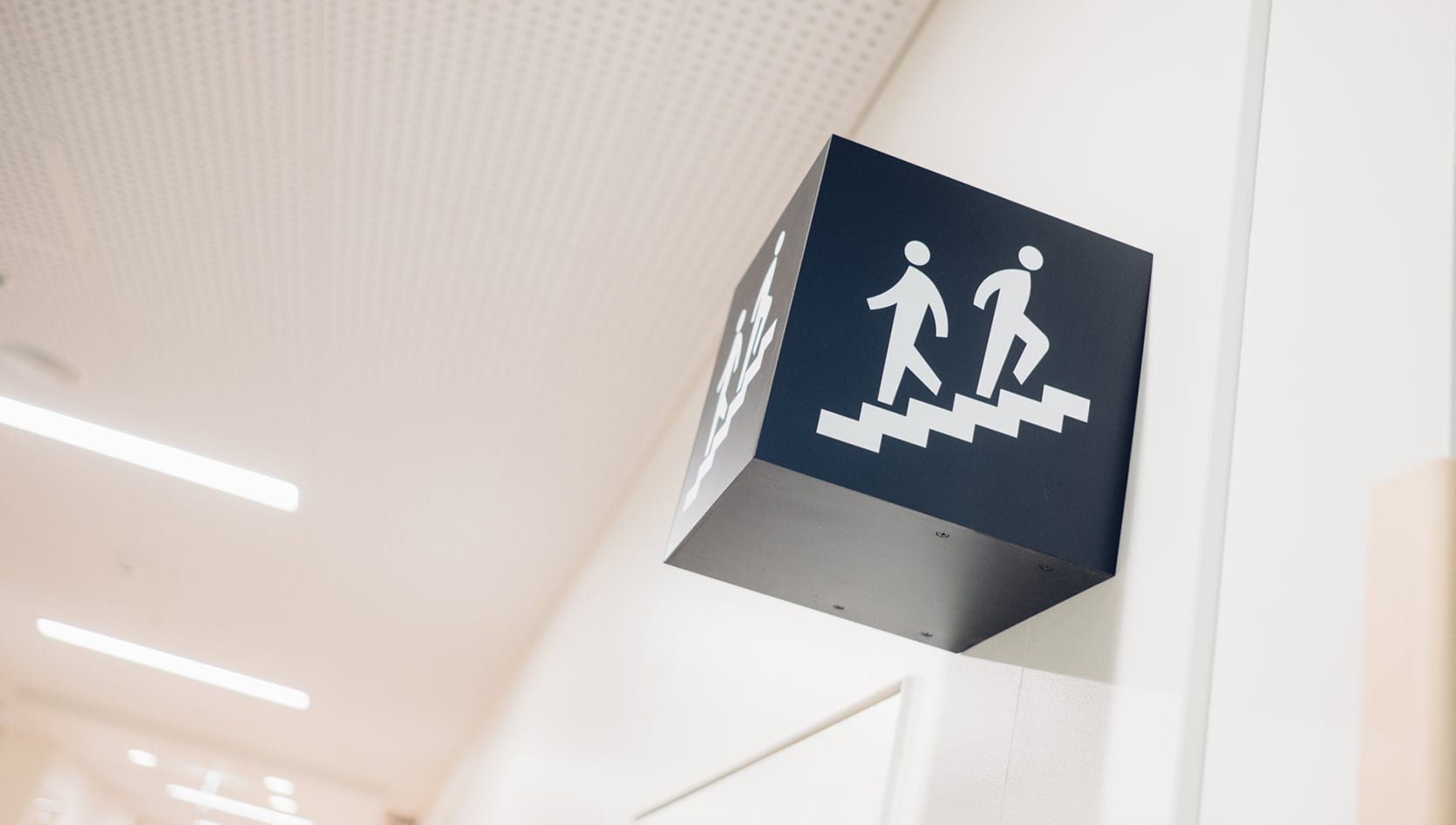
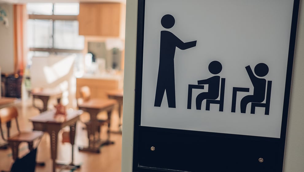
One I particularly like is the use of signs featuring pictograms. These are displayed everywhere, such as the music classroom, gymnasium, special classrooms, and even the principal’s office and the shoe cubbies. These same pictograms are used in our schedule timetables and teaching materials. This allows the children to understand visually and with ease where they have to go, at what time, and what they need to bring with them.
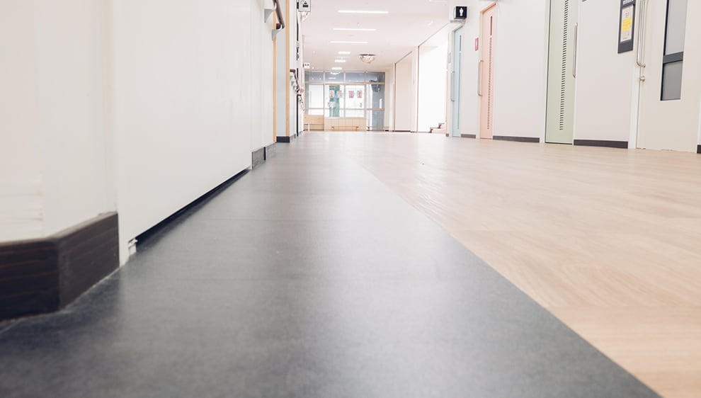
The edges of the hallways feature black lines 30cm wide. This is a subtle technique designed to convey the kids where they need to go. Hallways are, of course, crowded locations. If the children all start walking off in their own direction, it invites chaos. Even so, if you tell the children to follow the edges of the halls, some don’t really listen. They don’t quite grasp the concept of “edges.” Yet if you tell them to follow the black lines, they understand immediately. Now all of the children line up with ease. When the school day is done, I can see from my office the children lined up single-file and proceeding to the exit. This idea was a real eureka moment for us when MHS presented it to us.

We consider ourselves to be Japan’s best special education school.
I can say so with utmost confidence.
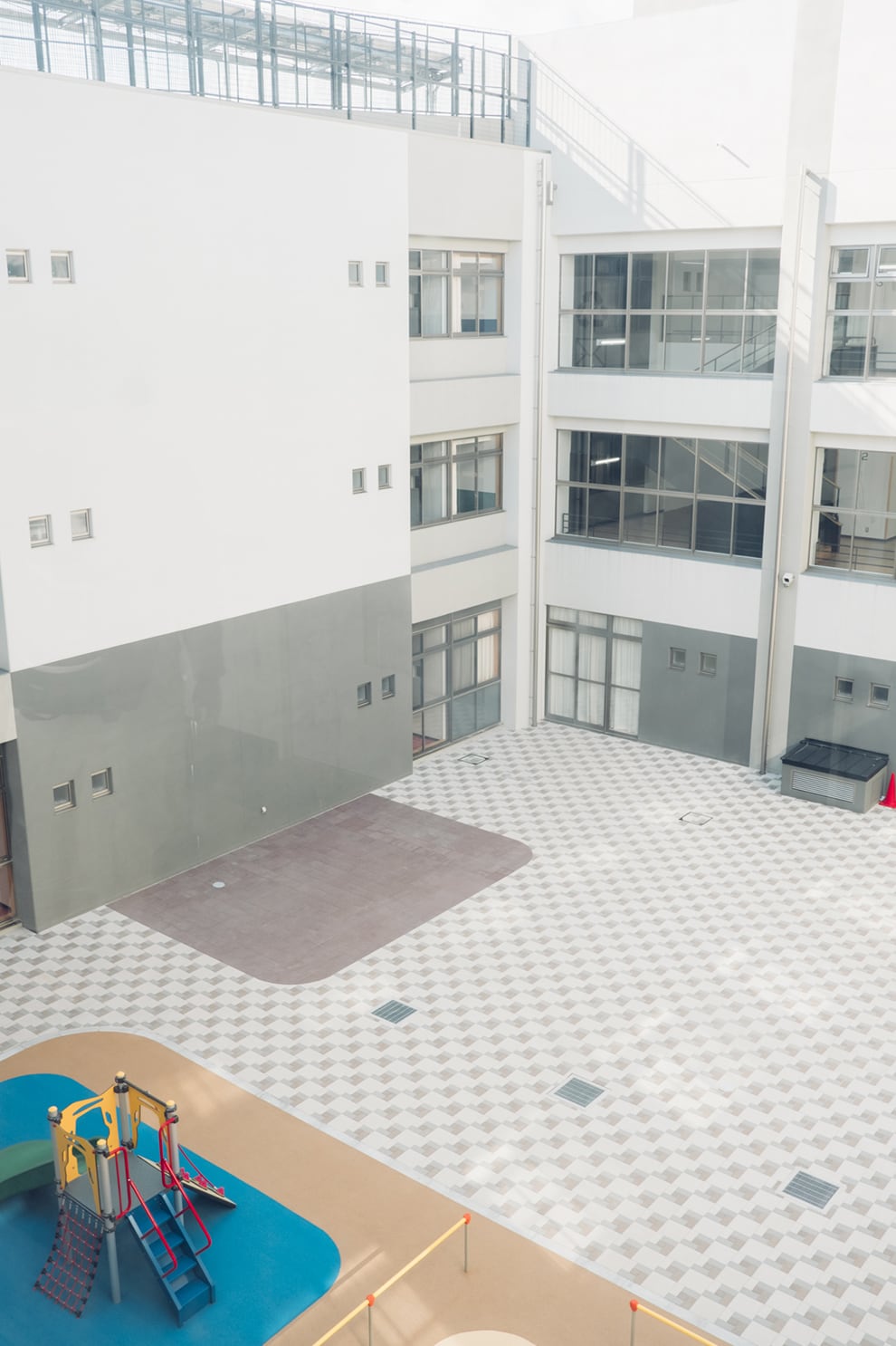
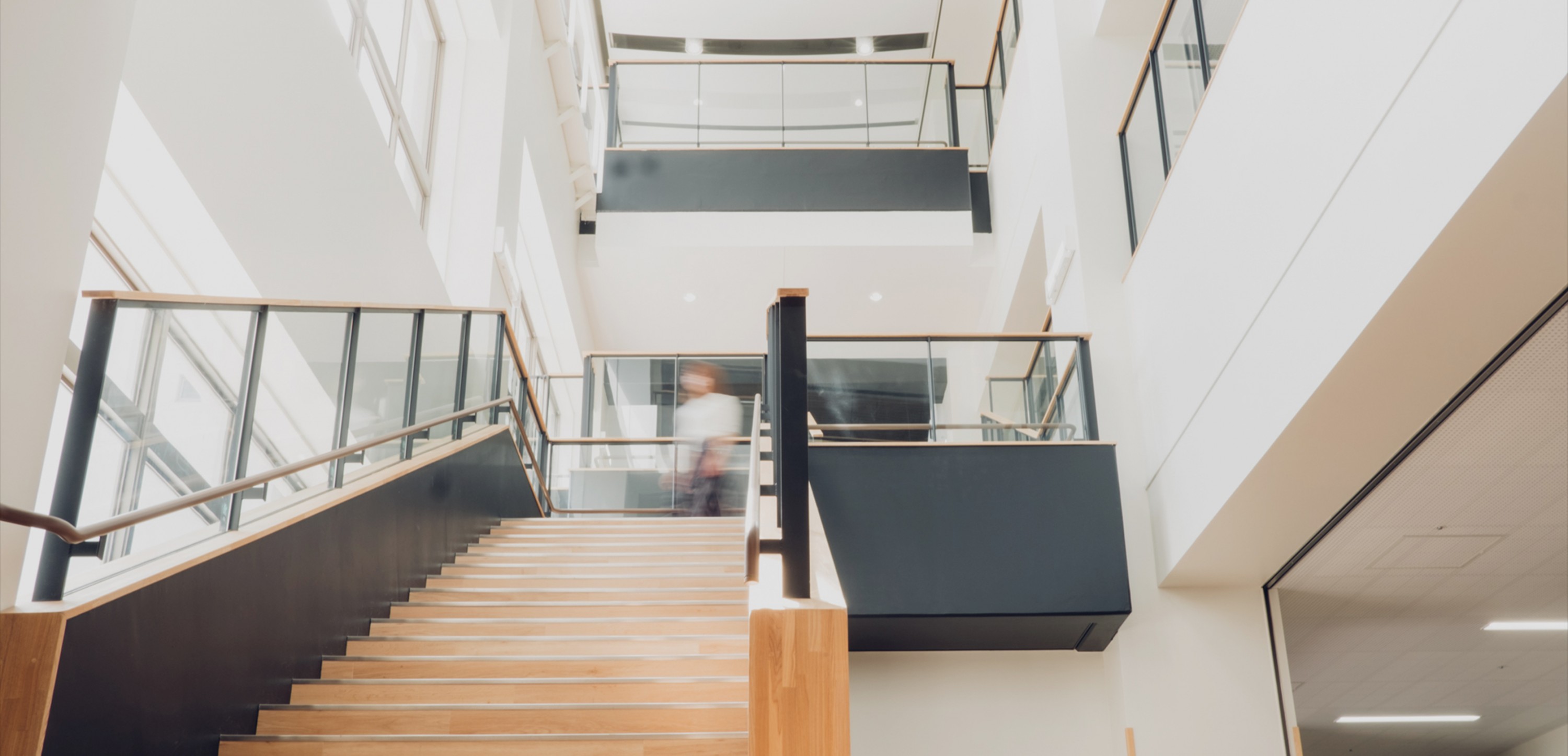
An open, spacious school that lets supervisors watch the children with care.
The hallways are shaped in a square formation around a central courtyard. Glass walls separate the courtyard and halls. This allows for ample light that brightens the space, and lets the children relax at the sight of the courtyard. In the event that a child gets astray, the open sight lines allow for finding him or her immediately. The hallways between faculty offices are also glass. This was done out of our request to make the offices brighter and more open. This allows faculty on the second floor to see from the first through third floors, with the courtyard in the center. This lets us see the entire goings-on throughout the school even while in the office.
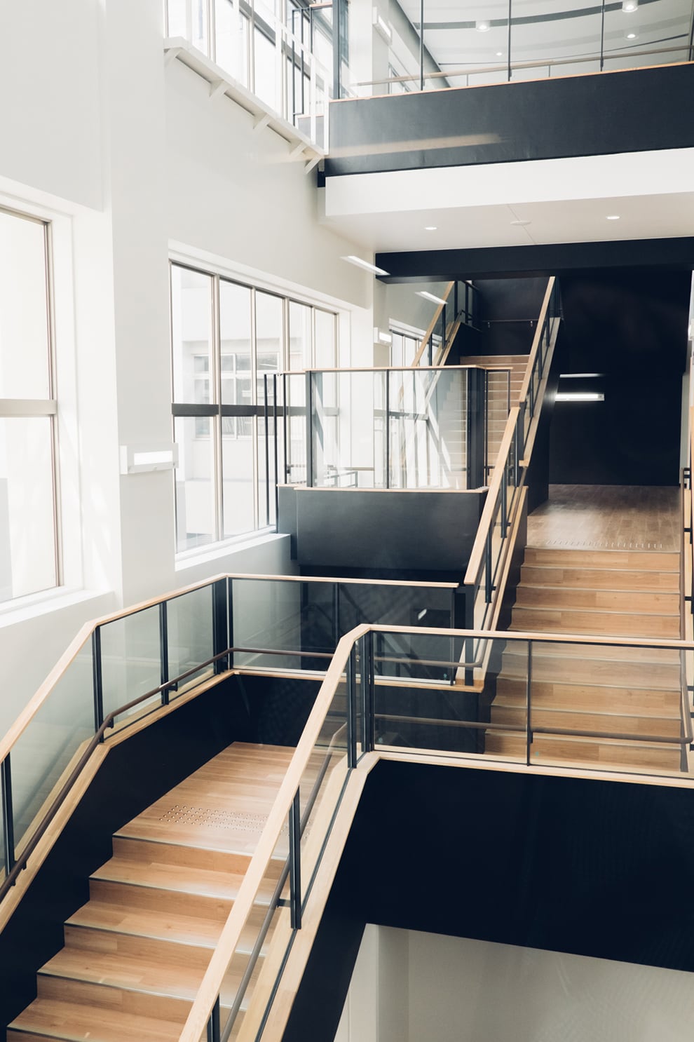
In front of the faculty offices is a central staircase that links the three stories. This staircase is frequently used by children and faculty alike, so it is lined with glass for enhanced visibility. The shape is somewhat unique. From the first to second floor, the staircase goes straight up. From the second to third, however, it forms a “U” shape and wraps around itself. This allows for immediately apprehending what floor you are on. This complex form also creates a more spacious atrium opening that acts as a landmark visible from all points. The open and pleasant space is now beloved by faculty and children alike.
Parents and guardians feel at ease bringing the children here.
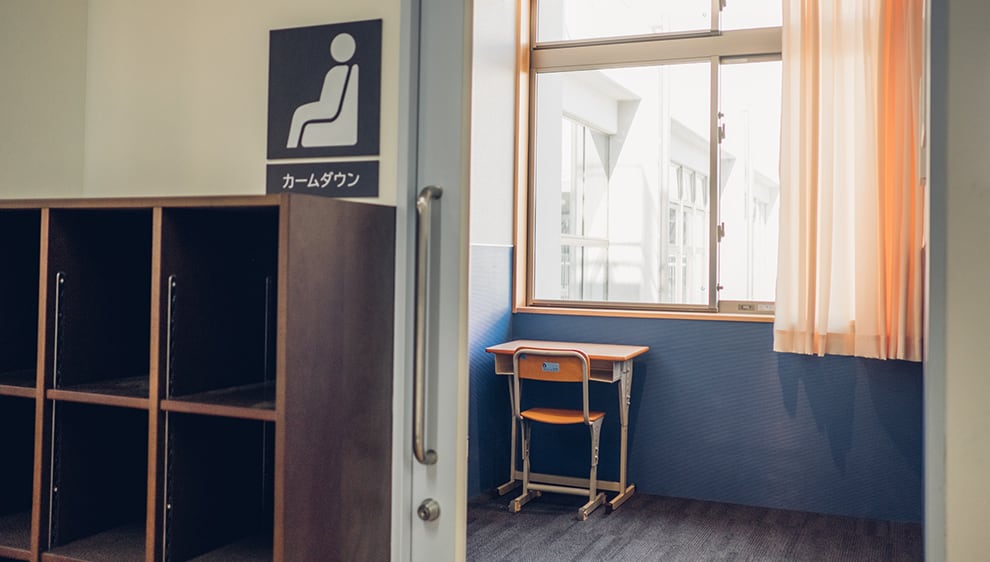
The design of the classrooms is deliberately simple. Unnecessary elements around the whiteboard have been eschewed in order to allow students to fully focus on the subject matter. The students are able to concentrate better and engage with the lesson. Children who struggle to focus are invited to the “calm down room” to relax. In most special education schools, empty classrooms are used for this purpose, but this school adopted a dedicated room. It is a small room designed to be just the right scale for a child and faculty member to enter. There are 2-3 such rooms on each floor. The materials and colors in each room vary slightly, and the light fixtures and bulb colors can be changed. A soft tungsten light is considered to be more effective at calming down agitated children.
The sports ground features a blue base, which has a calming effect, with white lines on top. This allows the children to both relax and engage in play while ensuring high visibility, letting them stay in the lanes when running. Between the ground and gymnasium is an audience area for viewing the sports. Here, children’s parents, grandparents, and guardians can watch the children at play during sport meets and other events. Some guardians were concerned about changes to the school before it was rebuilt. However, now they are all delighted at the result that was achieved. They seem to have witnessed a positive change in their children upon their return from school.
This, the ideal schoolhouse, was the result of a meeting of the minds between our faculty and the MHS designers.
We formed a project team within the school in order to aggregate the various ideas that faculty members pitched. We conveyed our requests and feedback to MHS, which actively incorporated them in their design, as well as offering up some ideas of their own. The finished product is even more pleasant and intuitive than we could have imagined. It is everything we and the children could have hoped for. We are exceedingly satisfied.

Employing every possible solution to make children’s lives brighter.
MHS Design Team
This school was designed to be safe and intuitive and incorporate feedback from teachers and specialists.
We thought long and hard about how to incorporate the insights that the faculty gave us. That was one of the most critical parts of the puzzle for this project. Considering that children derive a lot of information from visual stimuli, we designed strategies to convey important information through shapes and colors. The goal was to allow users to gain all of the information they need at a glance.
We wanted to make it the best design possible. That is why we went so far as to gain the advice of one professor, a specialist researching autism. We also researched case studies from overseas and actively incorporated ideas we felt were promising. One example would be the black lines and pictograms in the hallways. The different materials and colors used are intended to convey what role the different floors and spaces play. The first through third floors are divided up in ascending order for early elementary, mid and late elementary, and middle school students, and are respectively colored in pale pink, green, and blue. This lets students understand implicitly what their “home” floor is and what floor they happen to be on at any given time. The White Wood Hall and Black Wood Hall are used for inter-grade recreation and feature materials and a roof style that differ from the rest of the school. This visually conveys the idea that this is a space used for special purposes.
One key aspect of the design was the central staircase. The straight staircase from the landing between the first and second floors is offset. This is done so that if a child trips on the way up, they fall into the curve, rather than head on into the wall. The width of the steps was also designed with care. This central staircase is a landmark, but it still conforms to standard staircase widths so as to not confuse the user. This means one can grasp the handrail and remain on stable footing at all flights of stairs, rather than an unexpected dimensional change on one step.
We wanted to make this space memorable to children — something they will look fondly back on after graduating.
The principal specifically asked us to make this a place students will remember as their alma mater. The square motif found throughout the building is designed to reinforce this idea. Using a repeating shape has a strong visual effect associated with memory retention. the exterior of the school also forms this square shape, and the signage is also square. Furthermore, the intersections of hallways are square and use the thematic colors for each floor. This reinforces a motif for the school while also indicating that others may be oncoming from the opposite end of the hallway.
We are delighted to see that everyone is making intuitive use of the building in ways that exceeded our expectations. The first graduating class will be saying their goodbyes in March of 2019. It is our fervent hope that they will fondly look back on their time spent here.